Warm Spring Golf Course Branding
This project focused on developing a new visual identity for Warm Springs Golf Course during the construction of its updated clubhouse. Community feedback showed a desire for a symbol that reflected the course’s location and character. I worked directly with club staff and members and explored several logo concepts inspired by local wildlife and the landscape surrounding the course. The final design features a blue heron and Table Rock, creating a recognizable mark that now appears across signage, apparel, and merchandise to strengthen the club’s presence in the community.


I. Situation
Warm Springs Golf Course was preparing to open a new multi-million dollar clubhouse and recognized that their existing branding did not reflect the identity or character of the course. Members and visitors associated Warm Springs with the surrounding foothills, wildlife, and community atmosphere, but the course had no clear visual mark that represented these qualities. This lack of a unified brand made it difficult to build recognition, pride, and consistent merchandise offerings. Our objective was to create a logo that captured the course’s sense of place and could be used across signage, apparel, and future clubhouse materials.

II. Task
As the Designer, my role was to lead the development of a cohesive brand identity for Warm Springs Golf Course during the transition to its new clubhouse. I began by gathering input from course leadership, staff, and longtime members to understand what they felt represented the course and community. This feedback helped highlight recurring themes such as the Boise River, Table Rock, and the blue heron often seen along the fairways.
Using these insights, I created and refined several logo directions, experimenting with visual elements, typography, and composition. Each iteration was reviewed in working sessions to ensure it reflected both tradition and future growth. I facilitated discussion and feedback with stakeholders throughout the process to maintain alignment on goals and expectations.
Once the final logo concept was selected, I prepared brand assets for signage, merchandise, and clubhouse applications. This ensured that the identity could be used consistently across all touchpoints and would support the course’s presence as it entered a new era.


III. Action
We began by speaking directly with individuals who knew the course best. This included leadership, grounds staff, longtime members, and players who frequented the course throughout different seasons. These conversations helped us understand not only the history of Warm Springs, but also the emotional connection people had to the landscape, wildlife, and the view of Table Rock that defines the course experience.
We gathered visual references from the course environment and photographed key areas to capture tone and texture. The blue heron became a recurring motif during this phase, as many described it as a symbol of calm, familiarity, and presence along the river and fairways.
From there, we developed multiple branding directions, each exploring different approaches to iconography and typography. We shared these concepts in structured review sessions to ensure that the identity aligned with the values of the club and the atmosphere of the course.
Once we narrowed down the strongest concepts, we created refined logo variations and presented them to the community through a voting process. This allowed members to directly influence the final outcome and ensured the brand resonated with both past and present players.
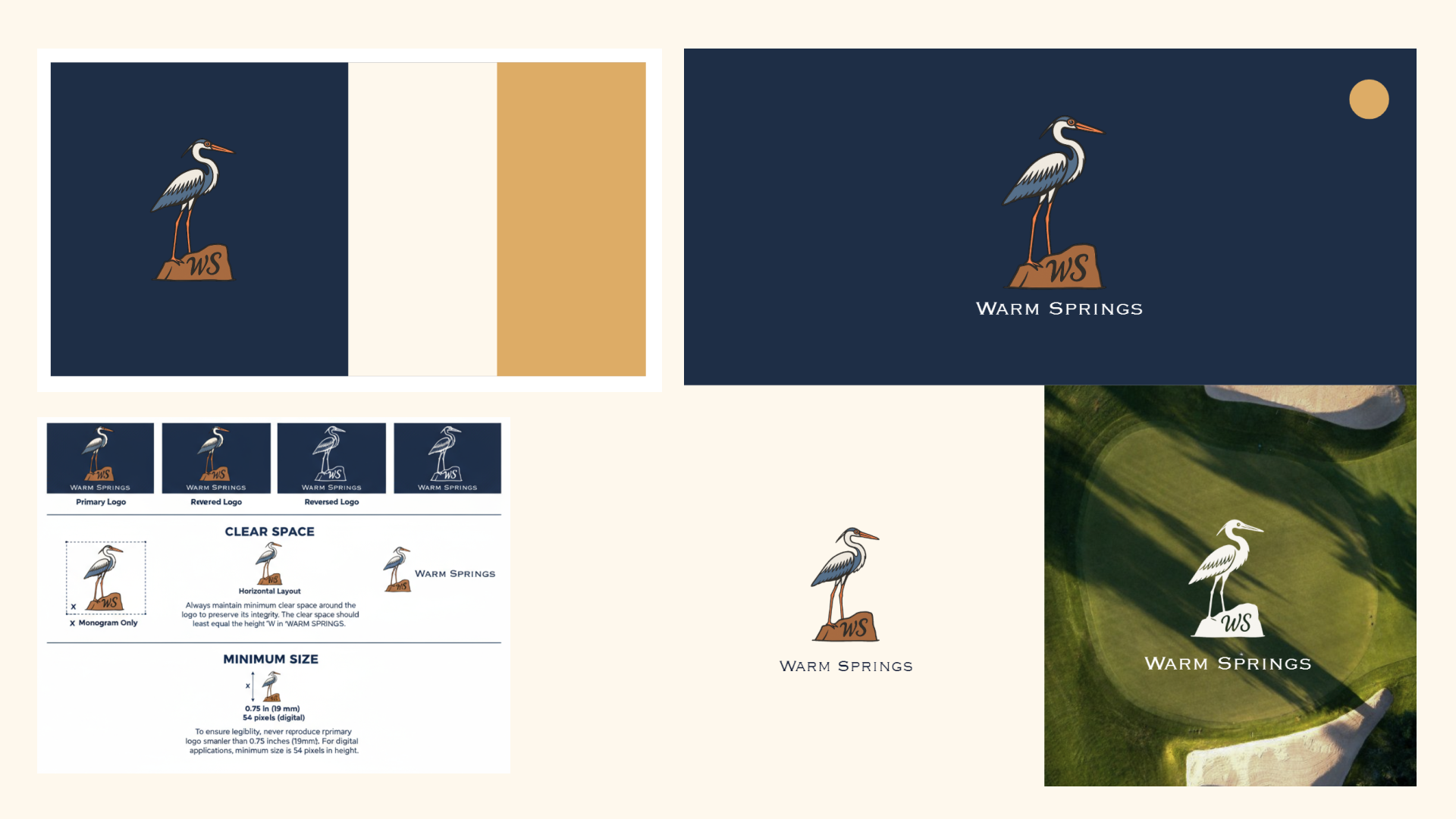
After the final design was selected, we prepared brand files, merchandise mockups, apparel samples, and signage-ready artwork. We also documented usage guidelines to maintain consistency across future materials and events, supporting Warm Springs as it entered this new chapter with a visual identity rooted in place and community.

IV. Results
The final logo was adopted as the new identity for Warm Springs and began appearing on hats, towels, and first-run apparel in the clubhouse shop. Early interest from members and staff led to a strong initial rise in merchandise sales, especially in items where the logo embroidered cleanly and stood out.
With the brand now established, the club is planning to expand into a wider range of gear including polos, headcovers, and seasonal apparel. There are also plans to apply the new identity across more physical touchpoints throughout the clubhouse such as entry rugs, signage, banners, and interior accents. This will help create a consistent presence and a strong sense of place throughout the facility.
The logo now serves as a recognizable symbol of Warm Springs, rooted in the local landscape and community experience, and will continue to grow as the clubhouse expansion progresses.